 |
Hands-On-Physics
HEAT & TEMPERATURE
|
Extensions
|
- Analysis -
|
The changing temperature inside the incubator is perhaps best visualized
with graphs. Here is a graph of the raw data the authors got. (Your data
might look different.) The light turned off at each peak and on at each
valley. Since this graph shows the resistance of a thermistor and the resistance
of a thermistor goes down as it heats up, we graphed it upside down, with
the resistance scale reversed. This makes hot at the top of the graph and
cold at the bottom. Since we have not converted the resistance values to
temperature using the calibration data, you cannot know from the graph what
temperatures these represent. Notice the way the temperature goes up and
down. The temperature never stabilizes, it just flips back and forth between
two temperatures. It looks like a the teeth of a saw. Do you see this in
your data? Can you understand why this is so?
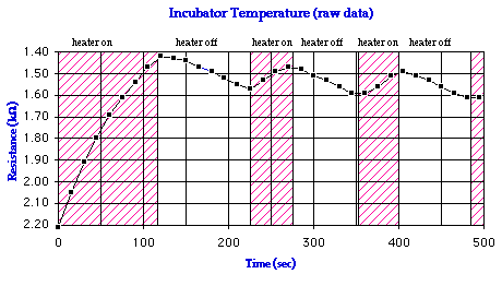
Figure E1
Raw Data
To help understand this sawtooth, we took some more data, shown below.
The up-and-down looks more pronounced but that is because the scale is different.
(Again, your data might look different) Note that the heating was quick
while the cooling took longer. Cooling is due to the loss of heat from the
can to its surroundings. Heating is due to the electrical energy put into
the light bulb. From this graph you can see that the rate of adding heat
by the bulb is much faster than the rate of heat loss. Do you see this in
your data? Can you explain why?
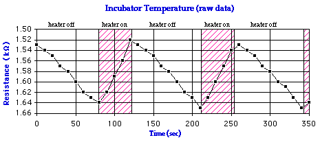
Figure E2
More Data
Previous Page ||
Up a Level ||
Index ||
Next Page