In AppleWorks, just enter the data in two columns (or rows), select them,
choose the menu item "Make Chart...", select the "x-y scatter"
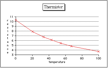
option, and you get something like the following. A graph like this is a
great help. If you have a computer in the lab, you can generate the graph
as the data comes in. Link to the graph blank cells from your spreadsheet
that you plan to fill in as you take data. These blank cells will not show
up on your graph. But as soon as you enter a new data pair on the spreadsheet,
the new point will appear on the graph. This can help you plan your lab
work. For instance, you can see from the graph above that there are some
gaps in the data; to cover the entire temperature range, your next data
should be taken around 80-85 °C or around 10 °C.