Hands-On-Physics | |
Heat & Temperature
|

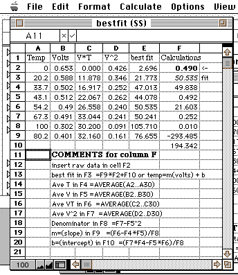
Here is a ClarisWorks spreadsheet showing the formulas needed. You don't
have to understand this; just copy this table, paste it directly into the
upper left of a ClarisWorks spreadsheet, and begin to use it. Enter your
calibration data into cells A2...B9 and enter your raw data into cell F1.
The best estimate of the temperature for that raw data will appear in cell
F2. You can leave some calibration cells blank and you can add more calibration
pairs, providing you copy columns C and D down to match your data. <<Teacher
Note>>

As you can see there are two new columns, one for the product of voltage
and temperature (V*T), and one for the square of the voltage (V^2). The
averages of each of these four columns are computed in cells F4 through
F7. Then these averages are used to compute the slope (a) and intercept
(b) of the straight line fit to the data. Finally, these values are used
in cell F2 to compute the best fit temperature from the raw data you put
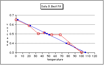
into cell F1. Column E has been used to calcuate best fit temperatures for
all the voltage data in column B.
Excel has a FORCAST function which makes this process even simpler.